Shortly before the end of last term I investigated the three exhibits showing jointly at Kulturforum Berlin. Sadly, the show has just closed its doors, but for those who missed it, I’d like to guide you through the scopic metamorphosis I experienced from this compelling Austellung, because it left a truly extraordinary impression on me.
Schrift als Bild (Scripture as Image: Calligraphy writing and art from the Middle Ages to Modern Times), Welt aus Schrift (World of Words: The 20th Century in Europe and the USA), and Einfach realitätsnäher! Leipziger Studenten zeigen Schrift (Simply more realistic! Leipzig students show type), collectively surveyed nearly a thousand year’s worth of inventive European and American typographic production.
As a curatorial endeavor, it redefined the perception of the written word and reaffirmed its pervasive involvement across many cultural fields. Alhough the fact of the text’s pervasiveness in visual culture may at first seem obvious, viewing the show reminded me just to what degree it is taken for granted.
Each exhibit presented a specific thesis. Schrift als Bild investigated the phenomenon of letters being composed either of mimetic images or of decorative patterning. The works of the exhibit — including a gigantic print by Albrecht Dürer – are primarily liturgical illuminations of Germany. Many of these fine prints and drawings are so unbelievably intricate that their viewing could benefit from the use of a magnifying glass. An example of this is the genre of “micography,” a style of portraiture that either defines shadow or contour exclusively by dense compositions of text. The letters building these images are sometimes no bigger than the tip of a pencil.
Reflection on Schrift als Bild got me thinking about the real meat of a symbol, or at least what it could be. I left with a more sensual interpretation of what our expression of writing entails. The stuff of letters – the intuited spirits within the ink – felt nearly biomorphic after observing this collection. If you recall the first time you gazed into a microscope and saw within the leaf of a tree the minuscule and normally invisible network of cells intermingling to construct a more complex structure, then you can imagine the similar feeling had after focusing on this compilation.
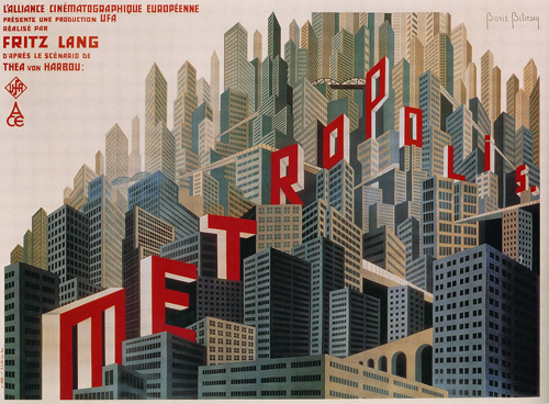
Now, from such a precise gaze, imagine zooming out. Tremendously. Welt aus Schrift was a salon of text-based media that is a nearly overwhelming visual assault. Housed in two separate rooms – each a massive space with ceilings reaching two stories high – this exhibit bombarded the viewer with text from every angle. From floor to ceiling on all four walls of each room were works of art, advertising, graphic design, and typography.
After squinting through the Schrift als Bild exhibit, I felt myself shrink in this new cavern of brightly lit works. Most of the pieces, for example the original design of the taken-for-granted “Apotheke” logo we see dozens of times each day, were originally intended for the public sphere. As a consequence, every piece screamed for attention, effectively trumpeting a colorful yet silent cacophony through the hall.
Having internalized the first exhibit, with that newly discovered sense for the substance and living element of text, this sensitivity infused itself into the interpretation of this visually loud space. The awareness cultivated from Schrift als Bild projected itself onto the walls of Welt aus Schrift and I practically felt gazed upon myself.
Finally, Einfach realitätsnäher! topped off the show with creative trends in contemporary typography. After moving through dramatically different spaces and histories, the more or less neutral space that houses this exhibit let the work speak for itself. It is here that a glimpse was caught of the future of image and text, and how the two will continue to mingle productively.
When observed holistically, the three exhibits speak of the ingenuity expressed via text by Western culture and document the impressions this vision has made upon the cultural landscape. Far from being provided with a simplistic, linear, historical survey of alphabets, visitors were presented with works from German Biblical illuminations from the Middle Ages, prints from the English Arts movement in the late 19 Century, typographic creations of Art Nouveau and early Modernism, Dada and the propaganda media of the 30s and 40s, paintings, prints and collages from the Pop and Fluxus movements, concrete poetry, tattoos and digital media.
What may sound like a visual deluge of dissonance actually articulated – in a beautifully concerted composition – a very particular subject in visual culture: the unique and sometimes vague margin between an image and a symbol.
When I left the gallery doors, my perspective of the metropolitan world I’ve walked through was unquestionably changed. The triad of exhibitions worked conversationally to persuade me into relating differently to the text that surrounds me daily.
After experiencing this visceral, dimension-based tour through semiotics, I left with a hyper-sensitivity to the simple act of opening a book, or peering down the sign-littered street. The show taught me how to imagine what it means to investigate the even emotional material of a single letter. Congrats to Kulturforum on an excellent show.
by Logan Woods (PY ’11, USA)
