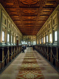
 The Laurentian Library is an official symbol of the growth of power and wealth of the Medici family in Florence. Commissioned in 1523, Michelangelo designed and began working on the building in 1525.
In 1535, Michelangelo left Florence and his work was finished, based on his designs, by Ammannati, Basari and Tribolo. The Library remains an important attraction for the city, but tucked inside of the cloister of the Basilica di San Lorenzo di Firenze, the site is easy to miss.
However, this important architectural site of the Laurentian Library is worth a visit, as it employs High Renaissance styles in a site-specific, and in some ways challenging, space.The entrance to the cloister, which is also the entrance to the Library, opens into a disorienting space.
The overpowering and magnificent staircase (actually three, joined together) leading to the Library is centered on one wall but does not face those entering the building. Instead there is another human-sized door, mirror-opposite and off-center, that implies a clear and humble path to the cloister.
The architecture of the small, but tall, vestibule can be described as oversized: Doric pilasters are large and frame fake windows and empty statuary boxes, composed of either Gothic or Renaissance arches, all surrounding the second tier of the room, while underneath the almost-empty walls are highlighted by enlarged scrolls that curiously intend to visually support the weight of the pilasters.
The staircase, which is larger than necessary, asks those who enter to turn 90 degrees to face the high entrance to the Library. Two small side staircases buttress a large center staircase whose steps, the edges of which are rounded and almost scrolled on the ends, appear exaggerated next to those typical, squared and rectangular steps adjacent to them.
This space may leave viewers perplexed not only about how the space functions, but how one should function in it, but it is possible to read Michelangelo’s plan as a depiction of classical forms in extreme as a way of emphasizing their own artificiality, where the human being is largely trumped and made miniscule in its presence, as to force a sense of humility and remind those of their finite duration of life.
The interior space, the reading room, is another challenge, as well. When ascending the grand staircase of the enclosed vestibule, into another enclosed space, viewers are confronted with an elongated and seemingly infinite hallway, instead of a place of rest or reading.
On each side of the hallway, mimicking a central vanishing point, are compact and interconnected wooden rows that function as tables, chairs and shelving (though books and bodies are no longer present). On the ground there is orange and white stone patterning that depicts grotesque and natural decoration, these are then reflected in an almost-mirror opposite on a wooden, carved ceiling.
Where the architecture of the vestibule seemed to reflect on and perhaps surmount the human as almost trivial, the architecture of the reading room reminds viewers of the possible Bacchantic revelry of passion and human experience.
Aside from these two spaces there were a few adjoining rooms: one small circular room, centered but adjacent to the hallway, with shelving for oversized books, where few (if any from the actual collection) remain today; at the end of the hallway, more small rooms renovated for a gift shop and exhibition space displaying rare books and illuminated manuscripts from the Medici collection.
The Laurentian Library is a curious space where readers are most-assuredly asked to confront their own human being when experiencing juxtaposed extremes of neo-classical architecture magnified and subverted, alongside ornamental detailing that carries natural symbols of rejuvenation and the grotesque.
And though Michelangelo’s designs may feel like an affront, they definitely, and importantly so, intend to bring these tenets of the Renaissance up close and personal.
by Jaime Groetsema (AY ’12, USA)
